[網頁設計]查看你的網頁在不同裝置上的模樣(手機平板筆電桌電)

一般寫網頁或BLOG的都會有這個疑問,就是我們的網頁在不同平台上看起來是如何?土法煉鋼的話就是拿手機起來開看看,但我們通常有iphone就沒android,反之亦然。所以我們需要這個小工具,兩秒就能知道你的網頁在其他裝置看起來的模樣
進入此工具網站:http://lab.maltewassermann.com/viewport-resizer/
安裝使用方式:就是把下圖那個藍方塊拖到書簽列上面就可以了,

再來到你的網頁按下這Resizer就可以看見工具列選擇別的裝置
按一次是直向,再按一次就變橫向了

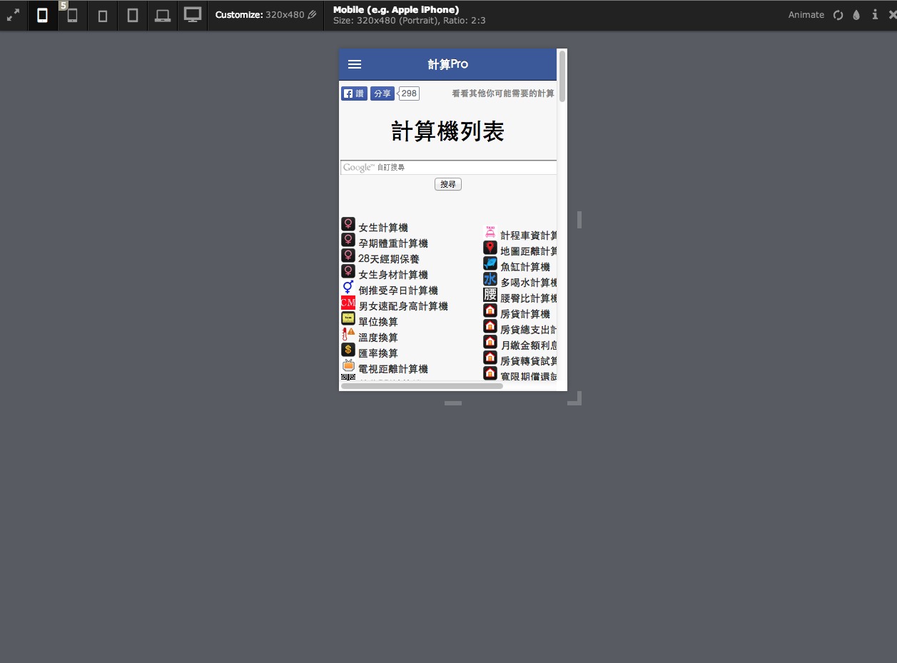
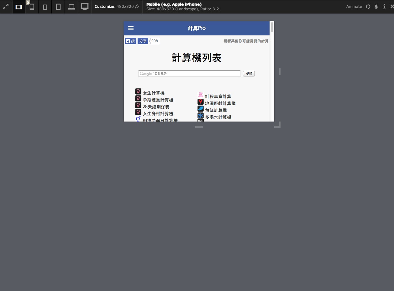
這很簡單沒啥好說的,我拿我的網頁試試看
Mobile (e.g. Apple iPhone)Size: 320x480 (Portrait), Ratio: 2:3
Mobile (e.g. Apple iPhone)Size: 480x320 (Landscape), Ratio: 3:2
Apple iPhone 5Size: 320x568 (Portrait), Ratio: 40:71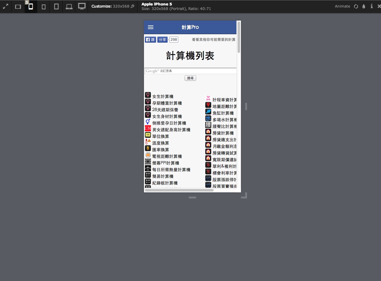
Apple iPhone 5Size: 568x320 (Landscape), Ratio: 71:40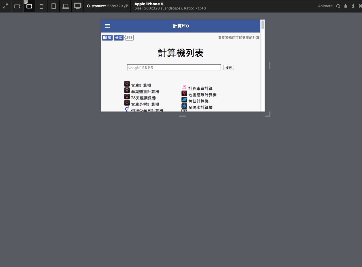
Small TabletSize: 600x800 (Portrait), Ratio: 3:4
Small TabletSize: 800x600 (Landscape), Ratio: 4:3
- Tablet (e.g. Apple iPad 2-3rd, mini)Size: 768x1024 (Portrait), Ratio: 3:4
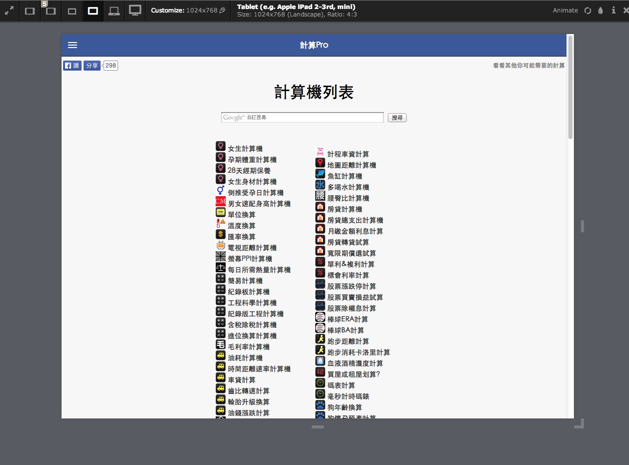
Tablet (e.g. Apple iPad 2-3rd, mini)Size: 1024x768 (Landscape), Ratio: 4:3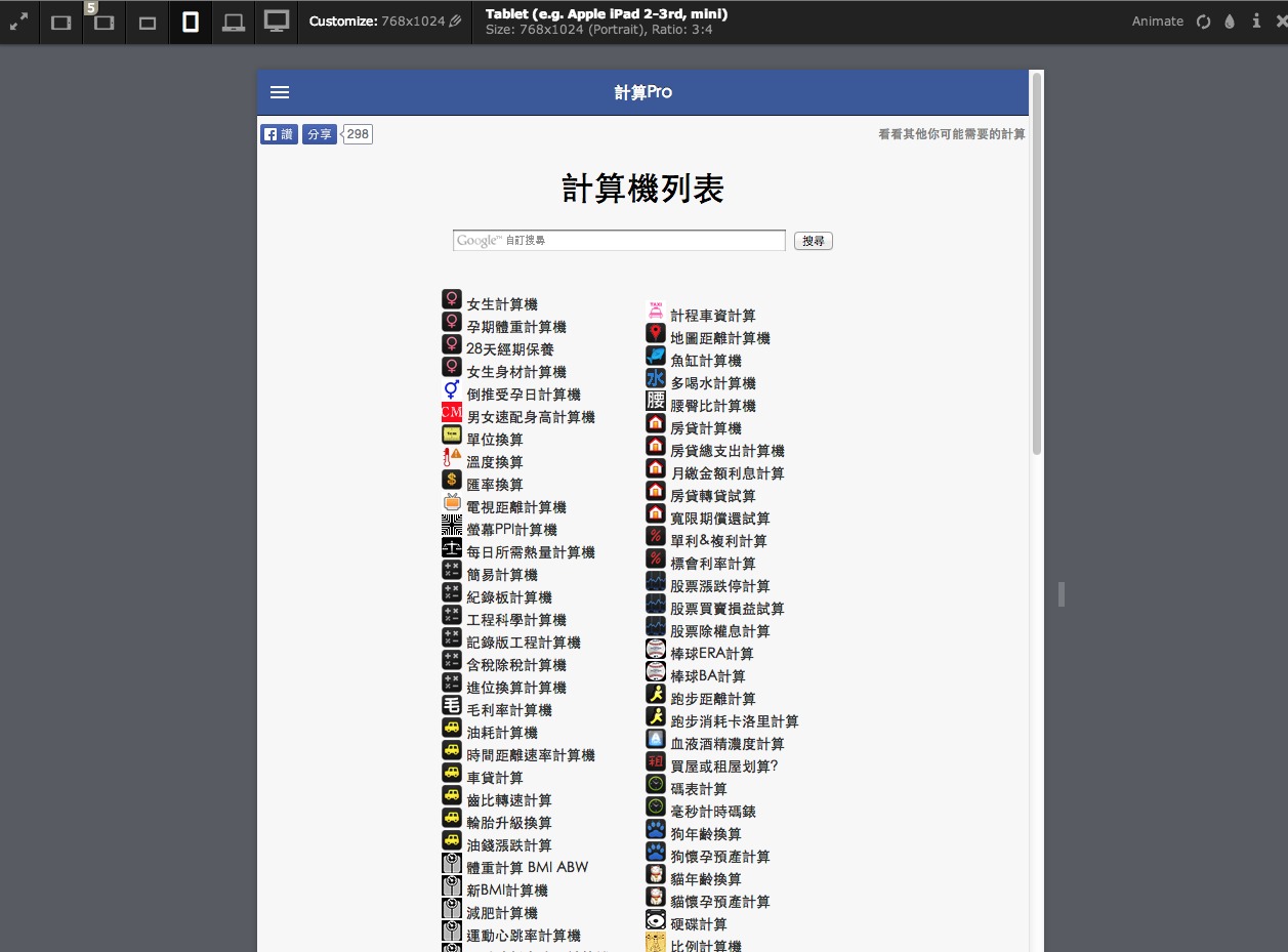
WidescreenSize: 1280x800 (Landscape), Ratio: 8:5
HDTV 1080pSize: 1920x1080 (Landscape), Ratio: 16:9


Comments
 女生計算機
女生計算機 倒推受孕日計算機
 寶寶天數計算機
 男女速配身高計算機
 體重計算BMI ABW
 多喝水計算機
 腰臀比計算機
 單位換算
單位換算 鞋尺碼計算機
 匯率換算
匯率換算 電視距離計算機
 數顏色計算機
 螢幕PPI計算機
 每日所需熱量計算機
 簡易計算機
簡易計算機 毛利率計算機
 油耗計算機
油耗計算機 歲數計算
歲數計算 電費計算
電費計算 文章字數計算
 黃金比例計算
 卡債計算機
卡債計算機 購車計算
購車計算 鐵馬計算機
鐵馬計算機 網路速率計算機
 抽籤計算機
抽籤計算機 日出日落計算機
 台灣計程車資計算
 地圖距離計算機
 魚缸計算機
魚缸計算機 冷氣噸數需求計算
 房貸計算機
房貸計算機 單利&複利計算
 股票漲跌停計算
 棒球ERA計算
 跑步距離計算
 血液酒精濃度計算
 買屋或租屋划算?
 循環計時器
循環計時器 狗年齡換算
狗年齡換算 貓年齡換算
貓年齡換算 硬碟計算
硬碟計算 比例計算機
比例計算機 計數器
計數器 抽煙計算機
抽煙計算機 酒錢計算機
酒錢計算機 線上倒數鬧鐘
 萬年曆&世界時間
 坪數磁磚計算機
 最佳睡眠計算機